Quickstudy
Brand & Web Design
Overview
In this project, I worked on a Brand Refresh and Website updates for a public relations agency client. The client wished to retain certain existing brand elements in the refresh. I began by creating a new logo and defining an improved color palette, fonts, iconography, and additional brand elements. I then implemented these elements into a refreshed web design on the client’s existing website. This project not only highlights my capacity to envision but also to execute a comprehensive brand strategy, resulting in a refreshed digital presence that aligns with the client’s vision and resonates with their market.
Project
Brand & Web Design
Position
Freelance Designer
Tools
Illustrator
InDesign
Figma
Squarespace
HTML/CSS
Timeline
1 week for Brand work
3 weeks for Web Design (2023)
Brand Work
Expanding the Color Palette
Workshopping the Logo
Original Logo -
Final Logo -
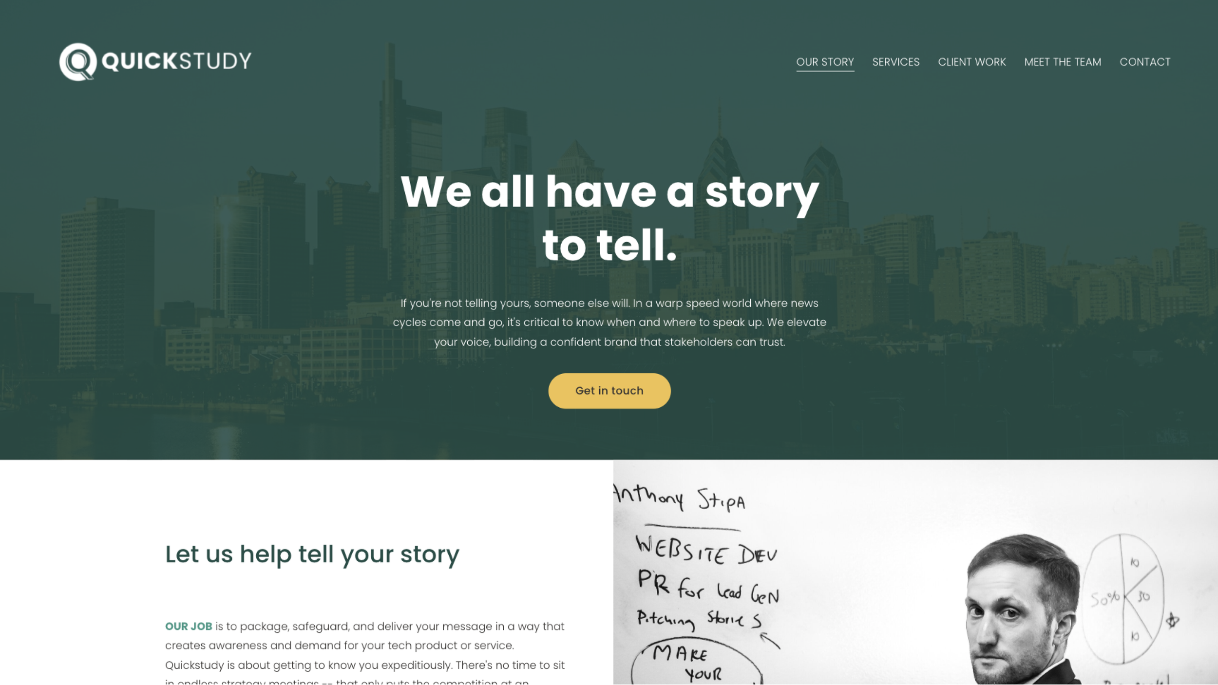
The client had existing brand colors he wished to continue using as to not have to overhaul the entire library of brand assets. Those were the dark green primary color and yellow accent. I modified the palette slightly by adding a mint green and neutral colors to create a more defined and versatile palette.
In addition to the client not having a high resolution or scalable vector version of the logo, I saw a multitude of ways to improve the logo design while not to departing too much from the original. Most importantly the Q felt off balance in its background circle. In the image below you can see my workshop in refreshing the logo. I played with idea of making the Q a bit thinner and extending the ‘tongue’ of the Q to resemble a magnifying glass. I thought this played well to the ‘STUDY’ verbiage in the name.
Ultimately the client chose to go with this version which had similar overlapping Q style to the original.
Web Design
Beyond updating the website with the new logos and colors, there was about 7 pages in the site that were updated with new layouts, imagery, CTAs, and content.


