Mockup Vignettes
Summary
This project involved revamping NeuroFlow’s product mockups. In order to tell a story around a complex technology, it is necessary to display the UI in a more concise way so that prospects and investors can get a better understanding of some of the value propositions of this mental health technology.
Figma
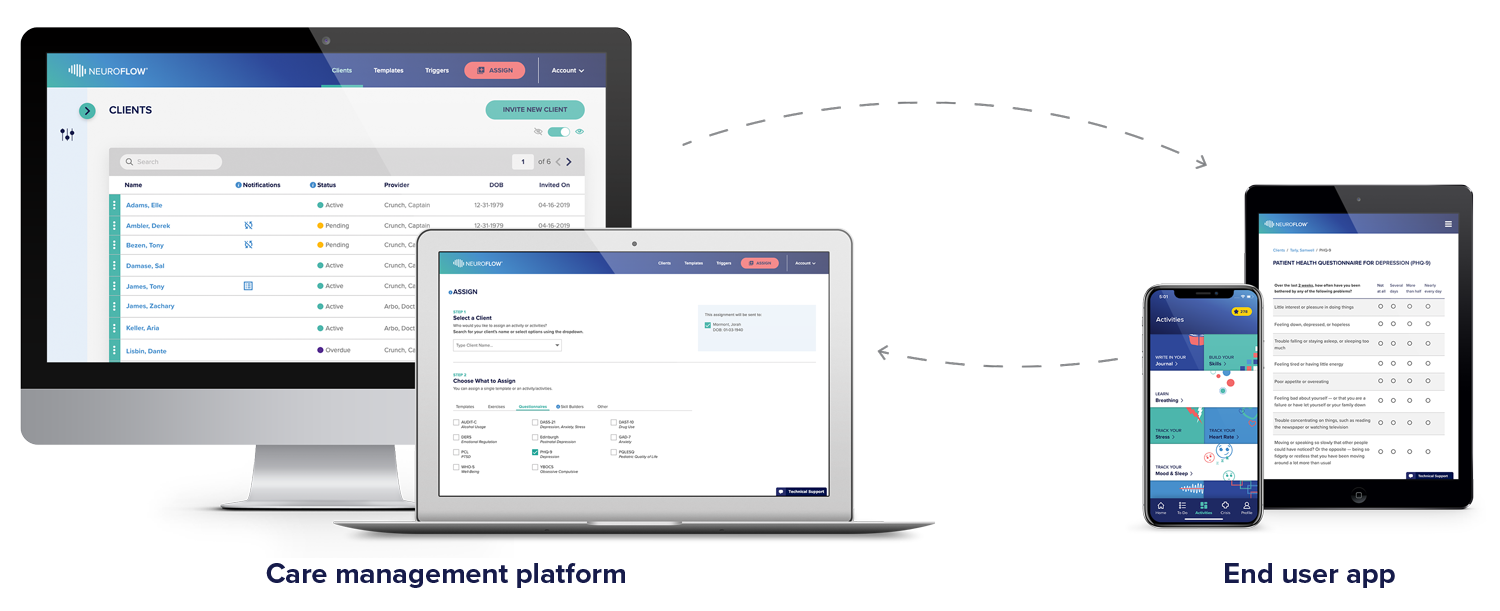
The Original NeuroFlow Product Mockup shown here doesn’t tell a concise story about the functionality of platform
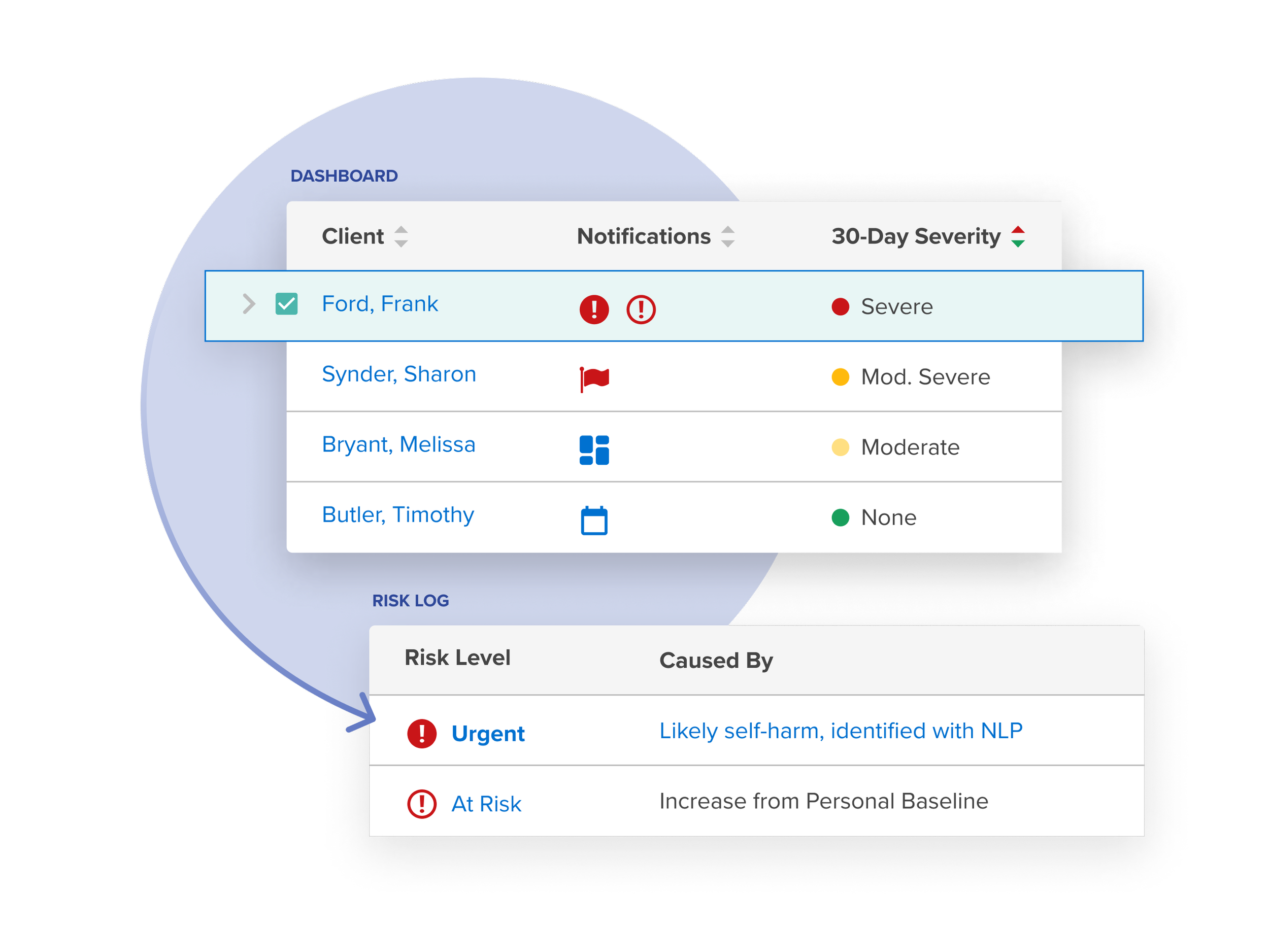
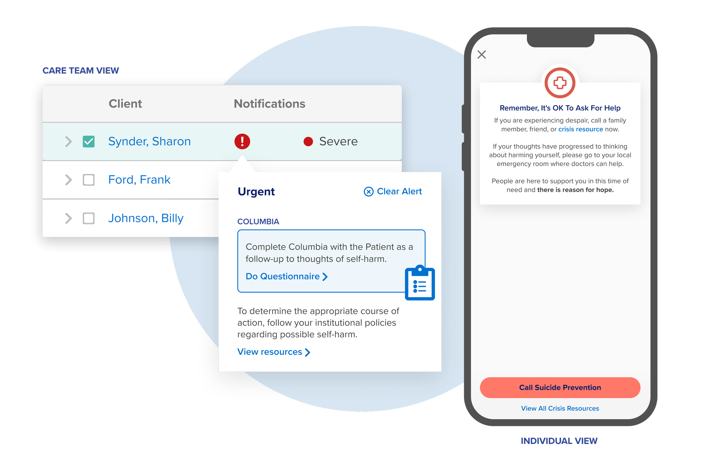
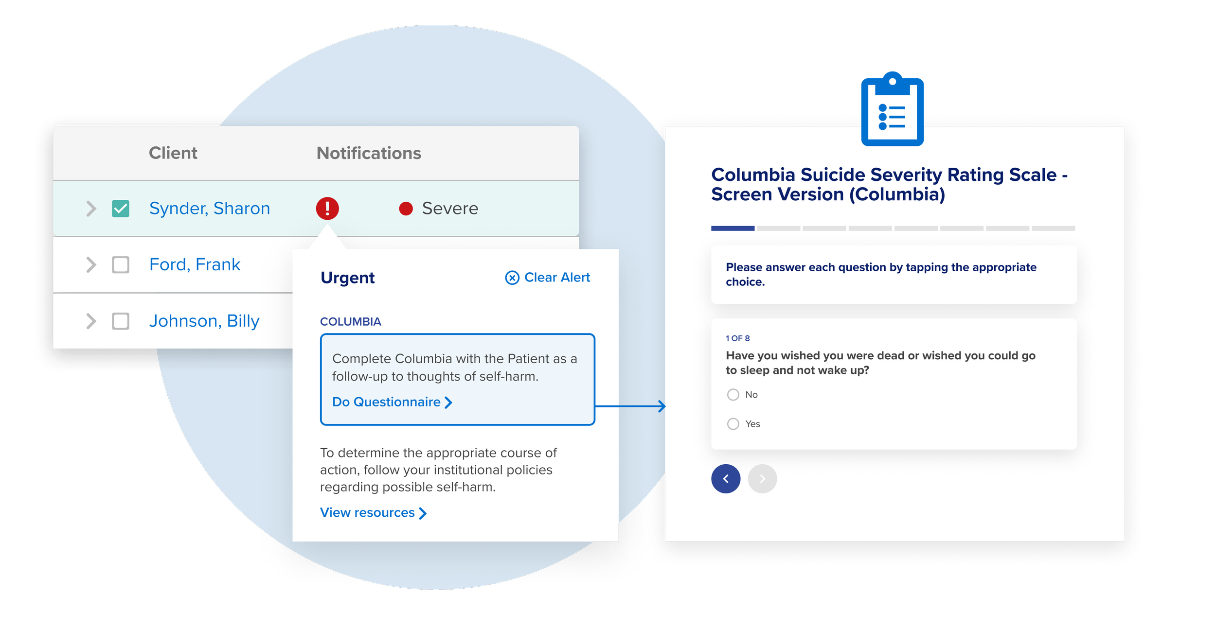
The platform’s features and UI are complex. It is technically two different platforms (Client and End User) that communicate with one another. To depict a feature or functionality it is necessary to break out the UI interface into smaller parts, combine components from both platforms, and visually sequence certain elements. This ‘vignette’ style of mockup was done for several different features in the platform.
Processs
Determine features we want to tell a story for
Breakout and simplify existing UI components
Combine components necessary to depict a feature (while remaining true the actual functionality)
Add highlights and visually sequence elements
Add labels for the interacting entities (Ex. Care Teams and Individuals)
Add aesthetic elements to glue disparate components together in a cohesive ‘vignette’
This particular vignette depicts a trigger from the Client side platform which assigns a specific ‘Journey’ to the end user side platform/mobile app.
You can see what a Care Team would see when assigning the content, and how that content would automatically appear in the Individual View.
Project
Mockup Vignettes
Position
Senior Designer
Tools
Timeline
2-3 weeks
(2023)


